ACN
RESEARCH
Vision + Purpose
The vision of Asian Creative Network (ACN) is to be seen. ACN represents a community of passionate, hard-working Asian creatives who wants to be seen and recognized in the public’s eye. This means that the brand visuals should be modern and easily recognizable. The goal is to imprint a lasting first impression that makes people curious about what ACN is.
DRAFT
Ideate + Sketch
I knew immediately I wanted to do something with the letters “A”, “C”, “N”, since “Asian Creative Network” would be too long as a text logo. I took out my book and started sketching.
/// My Biggest Problem
I needed to figure out how to transform the letters into an icon that will catch people’s attention. I tried multiple iterations of the design that turns “A” into a triangle. But I had a lot of trouble fitting both “C” and “N” into “A” in a minimalistic way.
DESIGN
Digitalize + Evolve
After choosing one design that I like, I created different digitalized drafts of it. I played around with its placement and shapes until I finally discovered a way to combine “ACN” into one icon.
First thing I said:"I'm a f**king genius!"
(definitely not narcissistic)
DESIGN
Refine + Color
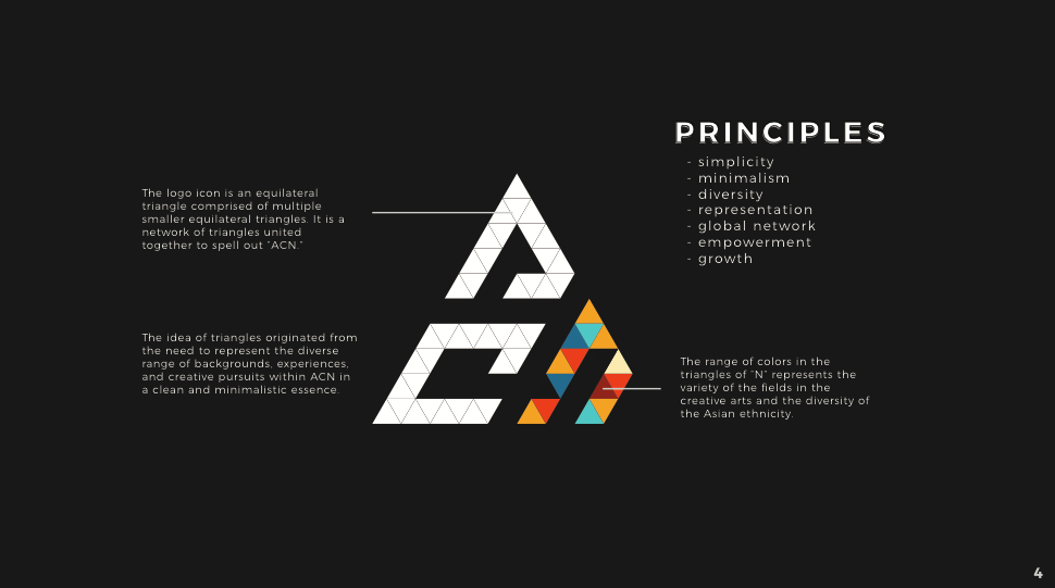
I retouched the icon into a proper path, and realized the whole logo is a equilateral triangle that can be constructed with smaller equilateral triangles.
/// A Few Issues
- The logo was off balance and unsymmetrical due to the cut off corner of the “N”.
- How do I depict the great variety of people within the creative arts field and the Asian ethnicity with only one or two colors?
/// Ultimate Solution
I purposely left the logo unsymmetrical, because ironically, it is the cut-off corner that makes the logo stand out more than a regular triangular logo does. The ACN brand visuals should be able to freely use any color in the spectrum. Using a triadic color palette would be the best solution, but it would be a little tacky to color the whole logo with triadic colors. Therefore, to emphasize both the colors and the triangle copmosition of the logo, I constructed “N” with little triangles of a triadic palette. To futher illustrate the idea that “N” is “composed” of triangles instead of “filled” with triangles, I cut off a piece of it.
BRANDING
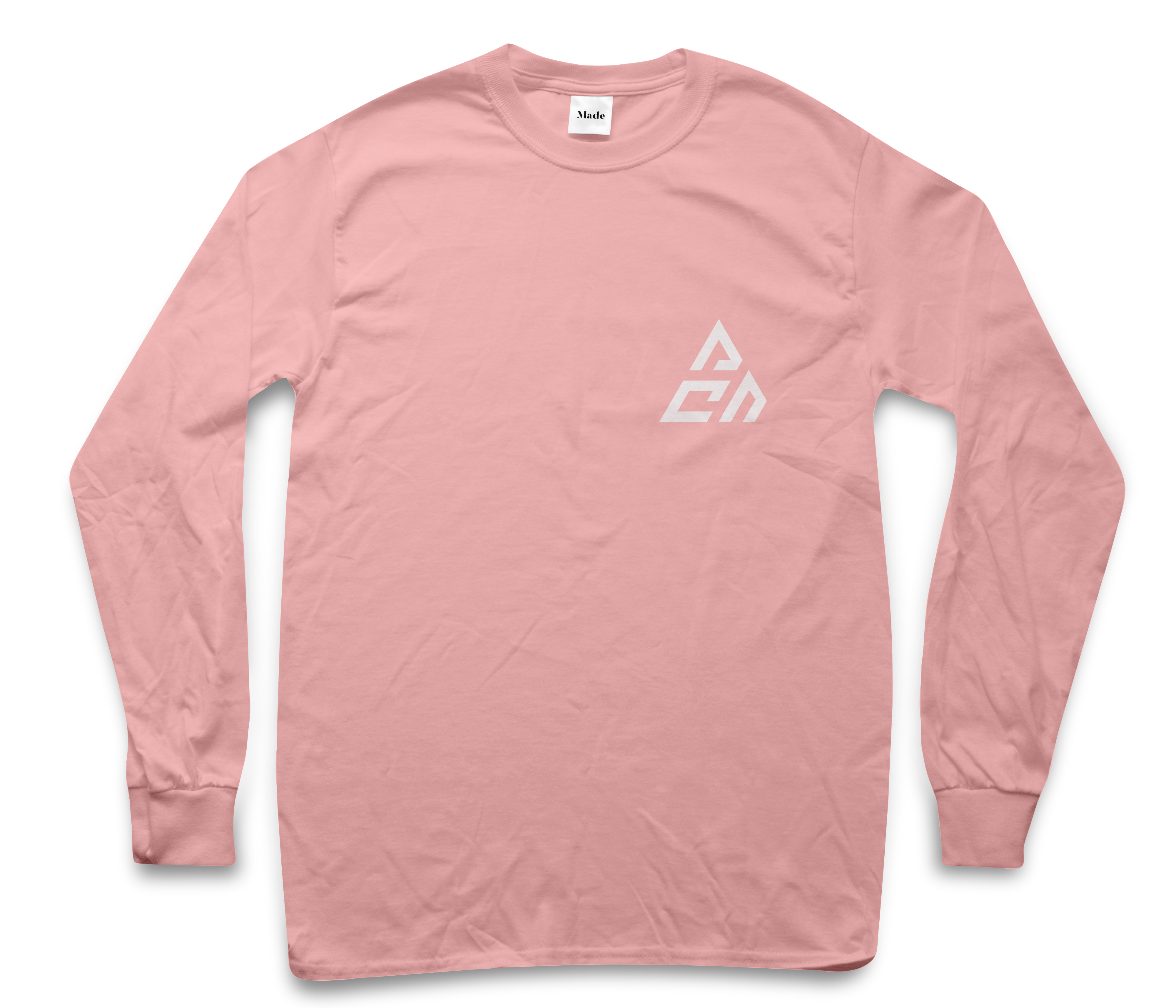
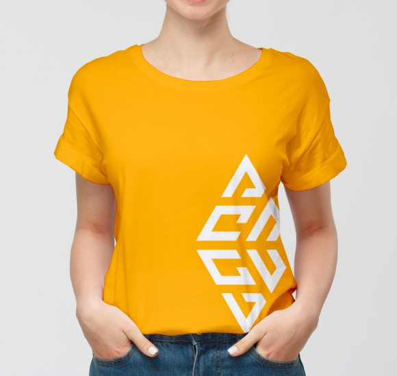
Print + Usage
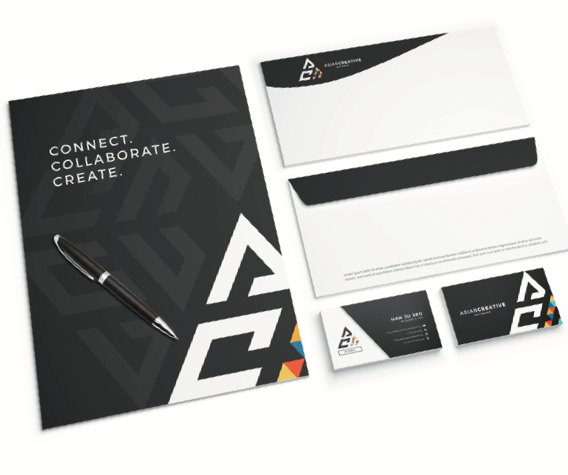
Now that the initial visual identities were created, it was time to curate a brand that would come to life. I designed multiple variations of print and digital products ACN can be showcased on, including business cards, merchandise, posters, instagram posts..etc. I also created the branding guide for ACN, which you can see below.
More Prints
BRANDING
Popularity + Presence
Since ACN began as a social media group, it is important for us to understand and utilize the power of social media to further push ACN as a community and brand. Our Creative + Marketing team has been working on different projects establish our online and offline presence.
/// Arigato Grande
One of the best collaborations that came out of ACN, Arigato Grande became the "Asian Ariana Grande" with her debut of the "7 Meats" MV. ACN members got together in less than 2 months and created a massively popular MV that has accumlatively gained over 1 million views worldwide.
7 Meats MVMore Prints
Brand Guide
Full Guide